Hug visual identity & packaging
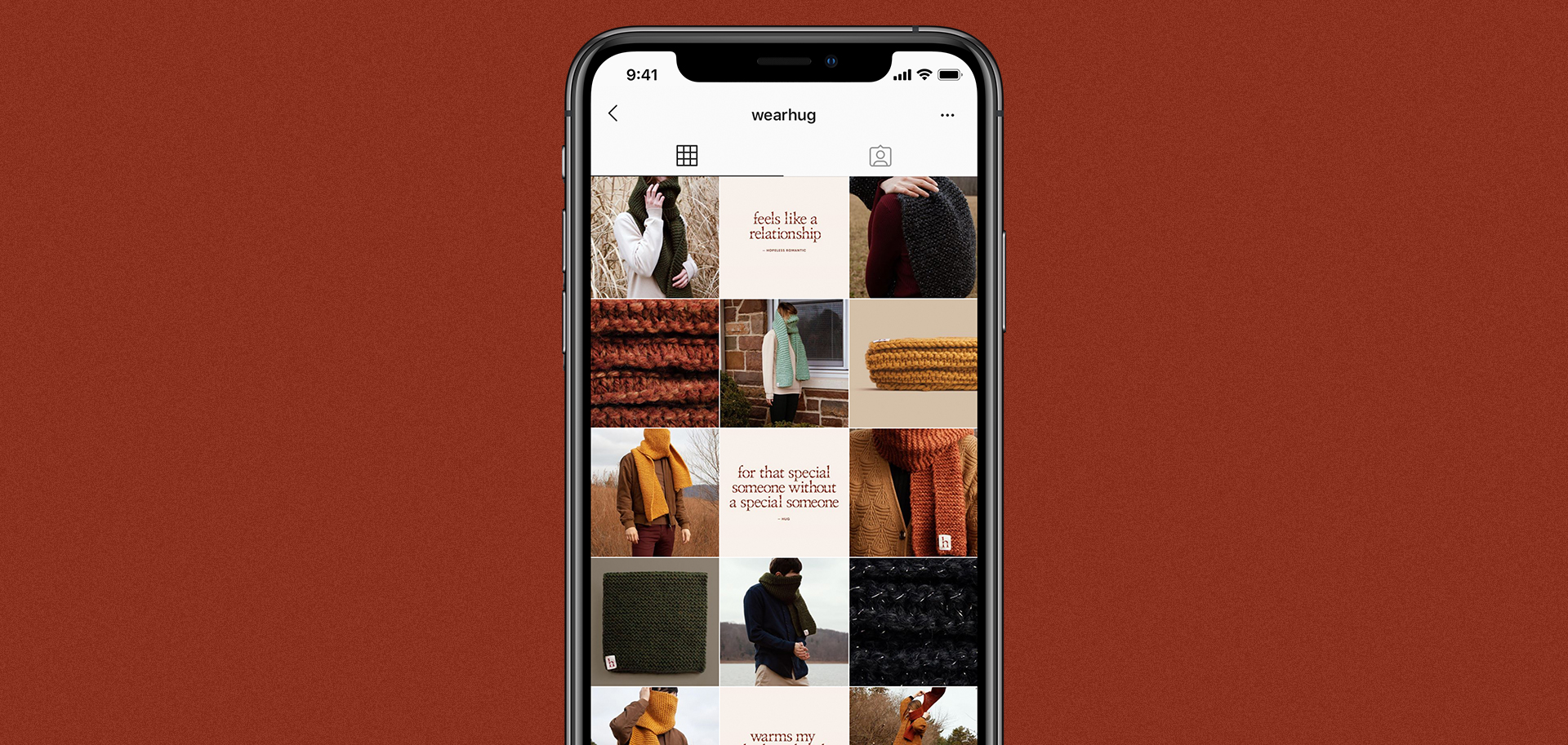
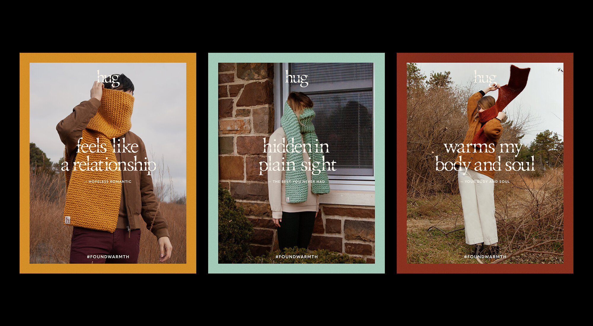
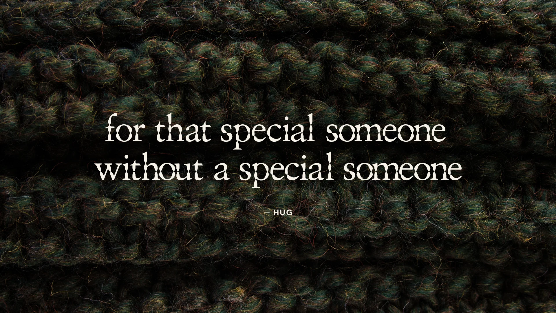
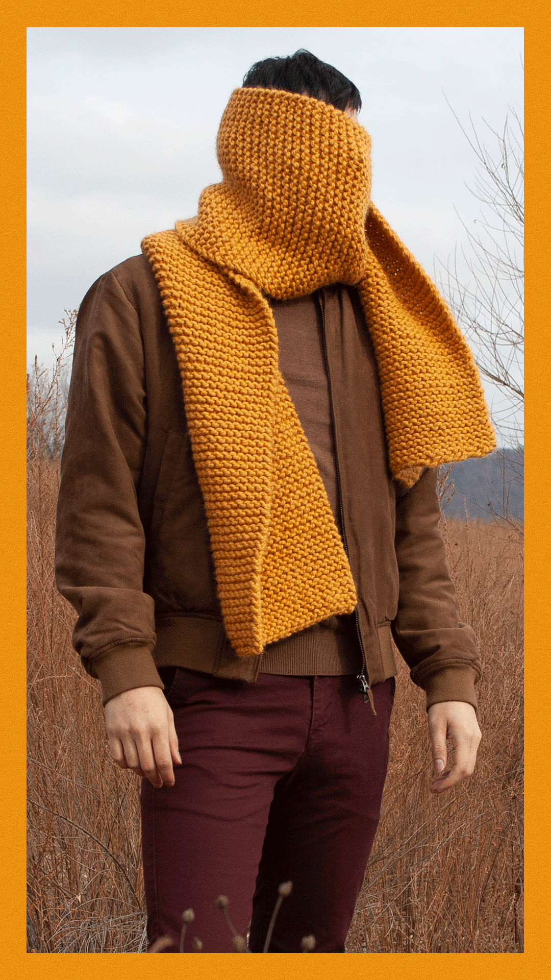
A passion project born from the search for warmth, Hug creates bespoke handmade knit-wear for the cold and alone. By pairing melodramatic photography with a theatrical tone of voice, the resulting brand identity is a caricature of the hopeless romantic. Earth tones and heavy focuses on texture create the feeling of a cozy and welcoming embrace while a custom typeface and simple visual system seek to elevate the brand as a whole.
Agency: Independent / Self
Client: Hug Scarves
Role: Design, Art Direction, Illustration
Photography: Lauren Nester
Styling: Katie Belloff
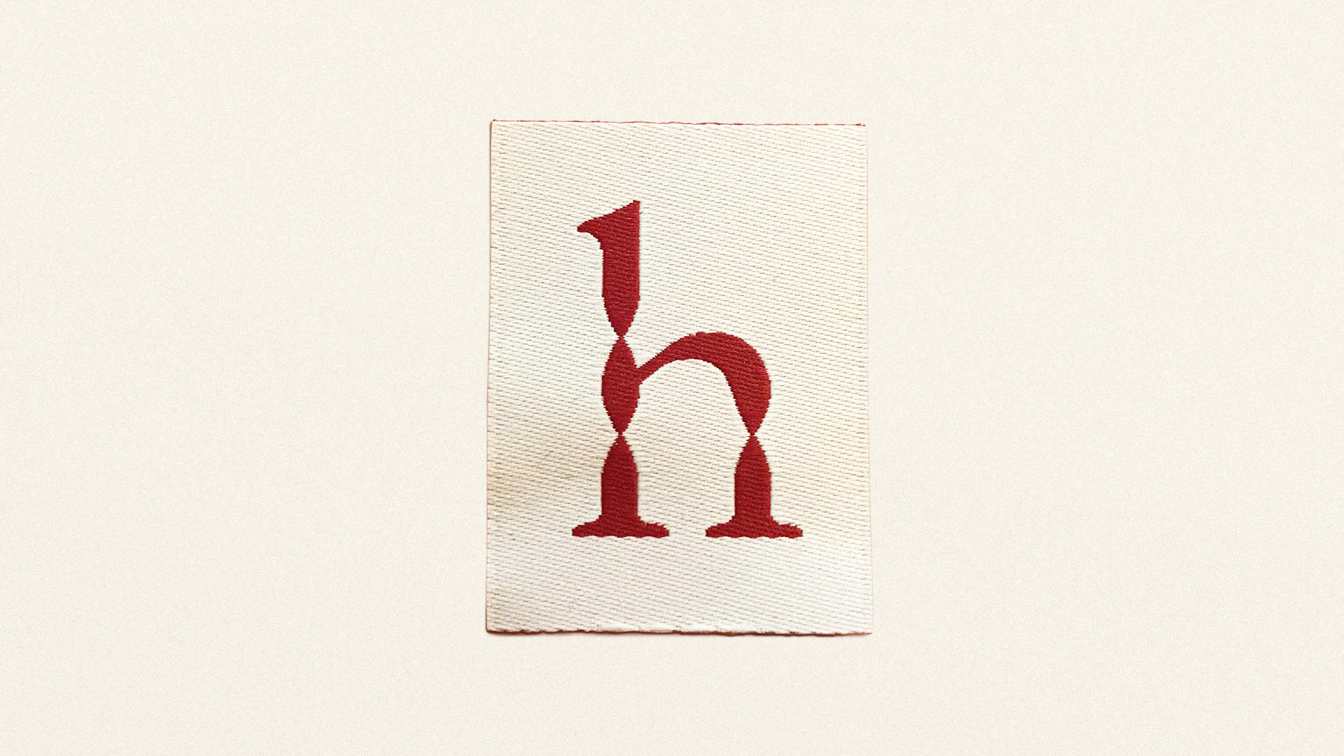

Custom Type
Because the brand design is so simple, a unique typeface was needed to create a better sense of ownership. The type needed to feel elevated and premium, yet warm and welcoming at the same time. The solution was a custom serif-based font inspired by the twists and turns of the scarves themselves.


Packaging
Mailers were created to ship the scarves door-to-door. The boxes themselves were kept clean and simple so that the scarves could act as the main focus. Aside from a few CTAs, a custom anecdote mirroring hug’s mission, by local poet Katie Belloff, was printed on the inside cover. The tagline, “found warmth” was also printed on the inside-bottom to be revealed once the customer removes their scarf.